Design Trends
Natural Wallcovering Color Trends 2026: The Earthy Palette
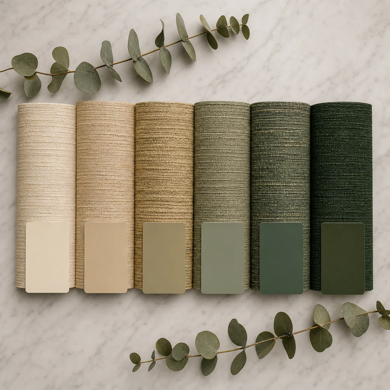
Cool greys are out. Warm earth tones are in. Here's the complete 2026 color forecast for natural wallcovering — from terracotta and sage to chocolate brown and moody deep greens. Plus how natural fiber absorbs and reflects color differently from paint or vinyl.
Key Takeaways
- Cool greys → warm earth — the dominant color direction shift of 2026.
- Terracotta is the standout accent — muted and sophisticated, not bright orange.
- Sage and moss greens remain staple biophilic choices.
- Rich browns are making a major comeback — chocolate, mocha, espresso.
- Moody darks for statement walls — forest green, burgundy, charcoal.
- Tone-on-tone layering replaces high-contrast patterns.
- Natural fiber absorbs color uniquely — creating depth impossible on flat surfaces.
What Are the 5 Color Families Trending in 2026?
| Color Family | Key Shades | Mood | Best Rooms |
|---|---|---|---|
| Warm earth neutrals | Sand, clay, limestone, warm taupe | Grounding, timeless | Whole-home foundation |
| Terracotta & rust | Muted terracotta, burnt sienna, adobe | Sunbaked warmth | Dining rooms, entryways |
| Botanical greens | Sage, moss, olive, pistachio | Biophilic calm | Bedrooms, offices, spa |
| Rich browns | Chocolate, mocha, espresso, walnut | Depth, maturity | Libraries, lounges, hotels |
| Moody darks | Forest green, burgundy, charcoal, plum | Drama, cocooning | Feature walls, bars, restaurants |
Why Do Colors Look Different on Natural Fiber?
Natural wallcovering absorbs and reflects dye differently from paint or printed vinyl — this is a feature, not a flaw:
- Fiber-level variation: Individual grass or sisal strands absorb dye at slightly different rates, creating micro-tonal depth visible up close but blending beautifully from viewing distance
- Light interaction: Woven texture catches and reflects light at multiple angles — the same wall shifts appearance throughout the day as natural light moves
- Warmth amplification: Natural fiber bases (warm yellow-gold in raw grasscloth) add warmth to any applied color — cool colors gain organic warmth, warm colors intensify
- Matte depth: Unlike vinyl's uniform sheen, natural fiber creates a sophisticated matte-to-satin range within a single surface
Bottom line: The same Pantone reference will look richer and more complex on grasscloth than on painted drywall. This is why designers specify natural fiber for depth that flat surfaces can't achieve. See our color matching guide for ΔE tolerances on natural substrates.
How Should You Pair Colors with Materials?
| Material | Best Color Families | Why It Works |
|---|---|---|
| Grasscloth | Warm neutrals, sage, chocolate | Bold weave texture + earth tones = organic drama |
| Sisal | Terracotta, forest green, charcoal | Fine texture takes deep color beautifully |
| Paper weave | Soft neutrals, pistachio, mineral blue | Delicate weave works best with lighter tones |
| Jute | Sand, clay, natural undyed | Coarse fiber's raw beauty suits earthy naturals |
| Cork | Warm browns, natural, metallic accent | Cork's own warm tone enhances brown family |
What Colors Should You Avoid on Natural Fiber?
- Bright, saturated primaries: Vivid red, electric blue or neon green fight against the organic warmth of natural fiber — they look artificial on texture meant to be natural
- Cool pure whites: Stark white on natural fiber shows the base fiber color through the dye, creating an uneven appearance — opt for warm off-whites instead
- Metallic silver: Cool metallic tones clash with natural fiber's warm undertone — go with gold, bronze or copper metallics instead
- High-contrast geometric prints: The organic irregularity of woven fiber fights against precise geometric patterns — let the weave be the pattern
How Do You Choose the Right Tone?
- Consider the light: North-facing rooms benefit from warmer tones (clay, terracotta); south-facing rooms can handle cooler greens and blues — see dark vs. light guide
- Match the mood: Calming bedrooms = sage/soft neutral; dramatic dining = chocolate/forest green; welcoming entry = warm clay/sand
- Sample in context: Always evaluate physical samples in the actual room at multiple times of day — see evaluation guide
- Coordinate with furnishings: Natural wallcovering acts as an organic "neutral" that pairs with most furniture — see paint pairing guide
- Think tone-on-tone: 2026's strongest look is layering similar tones with varied textures — grasscloth walls + linen curtains + wood furniture in the same warm neutral family
Frequently Asked Questions
Can I get any Pantone color on grasscloth?
Yes — any color is achievable. We offer custom color matching starting at 100 rolls. However, very light or very saturated colors may show more fiber-level variation than mid-tones. Our dye lab produces 2–3 lab dip options so you can see exactly how your chosen color translates to natural fiber before committing.
Will the trending colors look dated in 3 years?
Earth tones are cyclically resilient. Unlike trendy accent colors that peak and fade, warm neutrals, greens and browns are nature's own palette — they've been popular for decades in different expressions. The 2026 versions (more muted, more sophisticated) are specifically designed to feel timeless rather than trendy.
How do I match wallcovering color to adjacent painted walls?
The safest approach: pick the paint to complement the wallcovering, not the other way around. Natural fiber is complex and variable — it's easier to match a flat paint to a textured wallcovering than vice versa. Request a physical wallcovering sample first, then take it to your paint supplier for coordination. See our paint pairing guide.
Related Guides
Trends 2026
Full trend forecast.
Custom Colorway
Color matching process.
Dark vs Light
Tone selection guide.
With Paint
Color coordination.
Feature Walls
Impact wall design.
Mood Board Guide
Design presentation.
Sample the 2026 Palette
Request physical swatches in this year's trending colors — see how earth tones, sage and rich browns look on natural fiber in your own space.
Request Color Samples