Design Guide
Pairing Wallcovering with Paint: Color Coordination
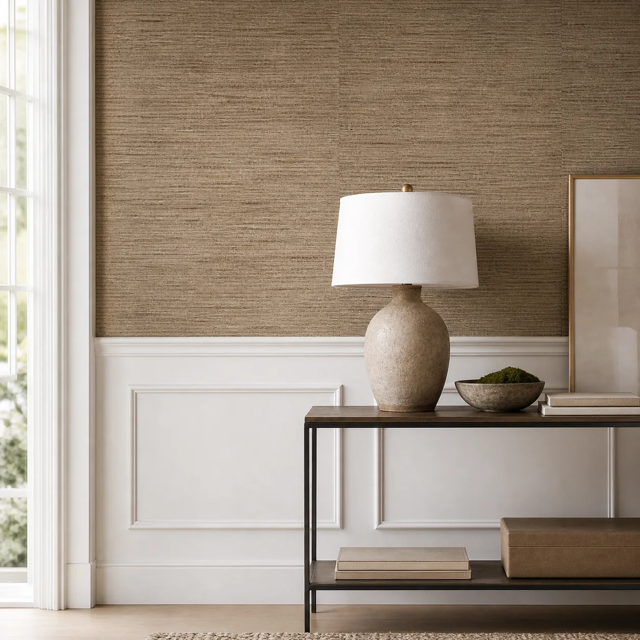
The art of coordinating natural wallcovering with adjacent painted walls, trim and ceilings. Pick the paint to complement the texture, not the other way around.
Key Takeaways
- See detailed sections below for comprehensive guidance.
What Is the Golden Rule of Paint + Wallcovering?
Choose the wallcovering first, then match the paint to it. Natural fiber is complex — multiple tones, texture, light-dependent variation. Paint is simple — one flat color. It is always easier to find a paint that complements a complex material than to find wallcovering that matches a specific paint.
How Do You Match Undertones?
- Identify the wallcovering undertone: Hold it against white paper — does it lean warm (yellow/gold), cool (blue/green) or neutral?
- Match the paint undertone: Warm wallcovering + warm paint. Cool + cool. Never mix
- Test in the actual room: Paint a 2x2 foot sample on the wall adjacent to the wallcovering sample
- Check at multiple times of day: Undertones shift dramatically between morning and evening light
What Are the Best Paint Color Strategies?
| Strategy | How | Effect |
|---|---|---|
| Lighter complement | Paint 2-3 shades lighter than wallcovering | Most common — wallcovering stands out |
| Tonal match | Same color family, different value | Cohesive, sophisticated |
| White/cream trim | Neutral trim frames the wallcovering | Clean, traditional |
| Bold contrast | Dark wallcovering + white walls (or vice versa) | Maximum drama |
How Do You Handle Room Transitions?
- Hallway to wallcovered room: Paint the hallway in the wallcovering's lightest tone for smooth transition
- Open plan with partial wallcovering: Carry the paint color from the wallcovered room to adjacent spaces
- Trim and molding: Keep consistent throughout — white, cream or a coordinated color
- See wainscoting guide for panel-to-wallcovering transitions
Frequently Asked Questions
Should I match the paint exactly to the wallcovering?
No. Exact matching looks like a mistake — the texture difference makes identical colors appear slightly different. Go 2-3 shades lighter or darker for intentional contrast.
Which paint finish works best next to grasscloth?
Matte or eggshell. Satin and semi-gloss create too much sheen contrast with the matte natural fiber surface. Keep the sheen consistent with the wallcovering texture.
Can I paint the ceiling the same color as the wallcovering?
Yes — this creates cohesion. Pick a paint that matches the dominant tone of the wallcovering. Or go bold and wallcover the ceiling too.