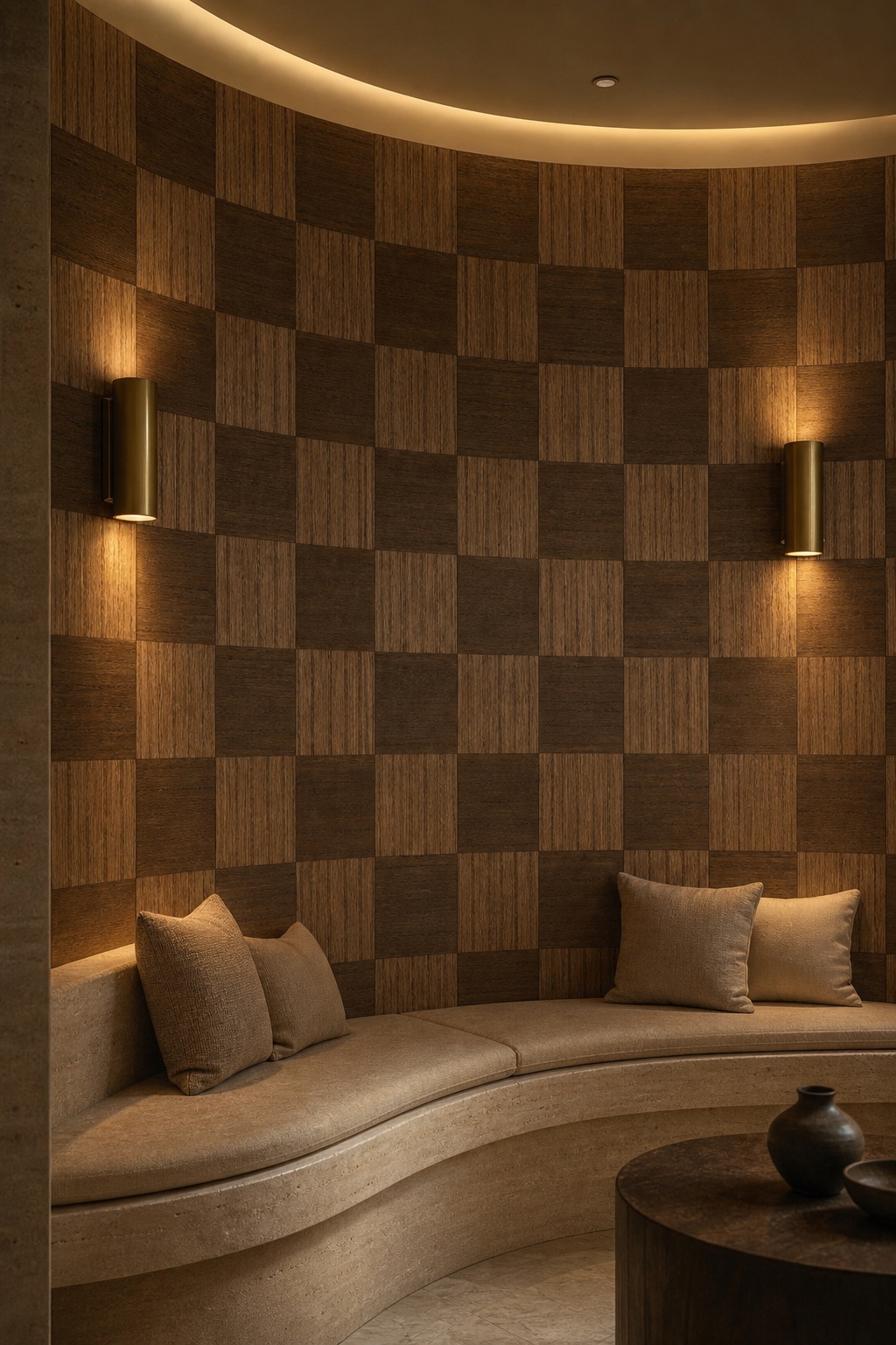
Walnut Veneer Wallpaper
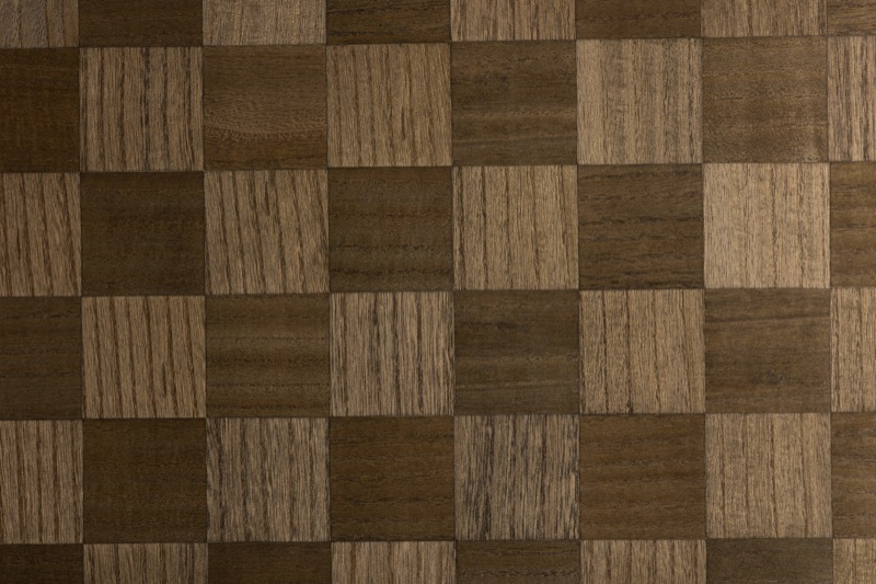
A walnut veneer wallpaper in a bold checkerboard tile geometry: alternating dark walnut-brown and warm caramel squares, each tile carrying visible horizontal grain lines that confirm the material's wood origin. Supplied to interior designers and trade buyers from 50 rolls (≈250 m²), Walnut Checker brings the warmth and natural figuring of engineered wood to a flat wall surface, without the weight or joinery cost of solid panelling. The contrast between the two tile tones deepens under directional lighting and reads as clean, architectural structure from across a room.
The Tile-and-Grain Dialogue: How Two Walnut Tones Read at Wall Scale
- The checkerboard alternates dark walnut-brown tiles with warm caramel-tan tiles; the tonal contrast is clearly legible from the far end of a room.
- Within each tile, horizontal grain lines run uniformly in the same direction, tying the two-tone pattern together and preventing the checkerboard from reading as purely graphic or flat.
- At close range, individual grain detail gives each tile its own character; at distance, the alternating tone grid dominates — a dual register that printed wood-effect papers cannot replicate.
- The bold tile scale produces fewer boundary lines per square metre than a fine mosaic, so the geometry reads clean and architectural rather than busy.
- The pattern is rotationally neutral, with no hang-direction preference and no reverse-hang requirement, which simplifies panel planning and reduces layout errors on irregular walls.
The checkerboard works at wall scale because both tile tones share the same grain direction and warm undertone — they read as one material family, not as two competing colours. Step close and the grain lines assert the surface's organic origin; step back and the alternating tones resolve into a measured, geometric rhythm. That shift between tactile detail and architectural structure is what separates a genuine veneer face from a flat-printed pattern.
Warm Walnut in Shifting Light: Matte-Satin Depth Across the Day
- Warm undertone reads amber and golden under tungsten or warm-LED sources; cools to true brown under cooler northern daylight.
- The matte-satin finish absorbs most direct light rather than specularly reflecting it, so minor substrate imperfections are less visible than under a gloss surface.
- The darker walnut tile absorbs more light while the caramel tile reflects slightly more; the contrast between them shifts subtly as the angle of illumination changes through the day.
- Side-raking or directional wall-wash lighting enhances grain texture within each tile; recessed downlights emphasise the tile-boundary contrast.
- In low-light evening settings the checkerboard reads as a single, warm unified surface; strong diffuse daylight sharpens tile definition and reveals more grain detail.
The matte-satin surface keeps Walnut Checker from competing with polished finishes elsewhere in the room. Under warm artificial light the brown tiles recede and the caramel tiles lift, giving the wall a soft, pulsing depth. In strong northern daylight the contrast flattens slightly, which can suit spaces where the wall should recede behind furniture rather than command attention — a useful property when specifying a full-height feature wall opposite large glazing.
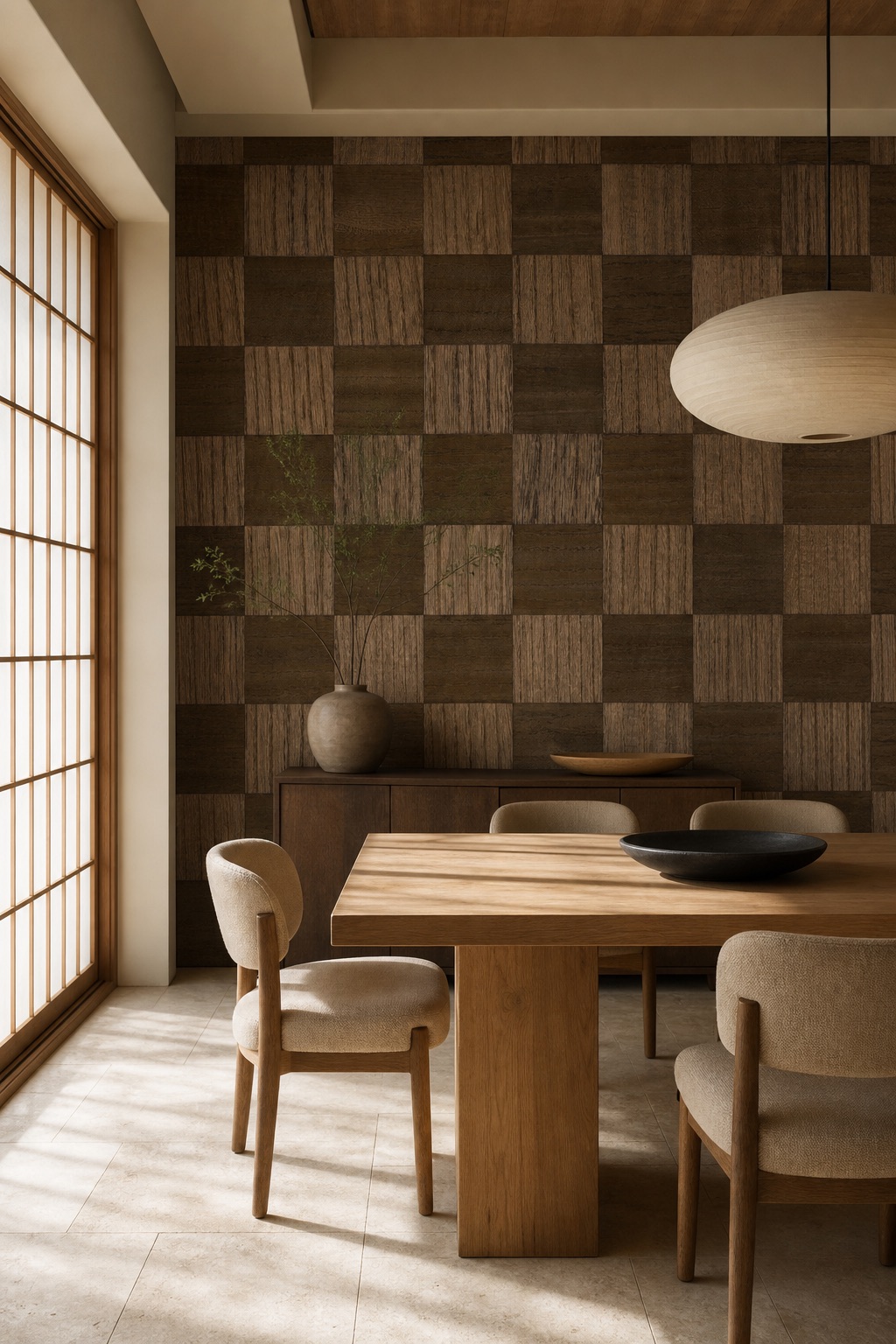
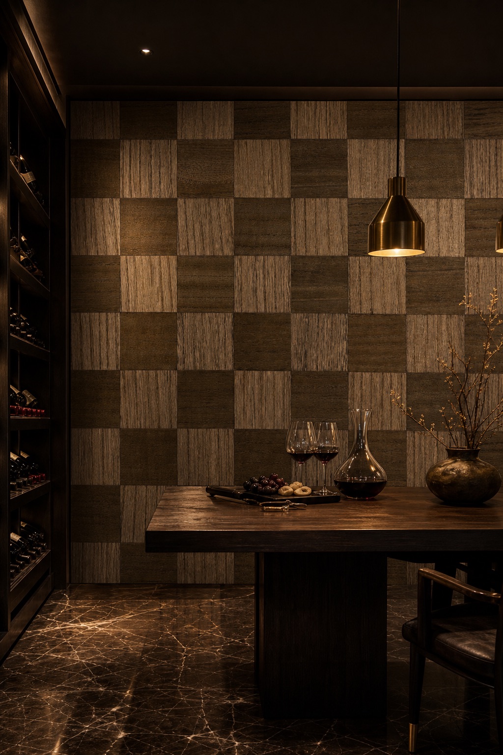
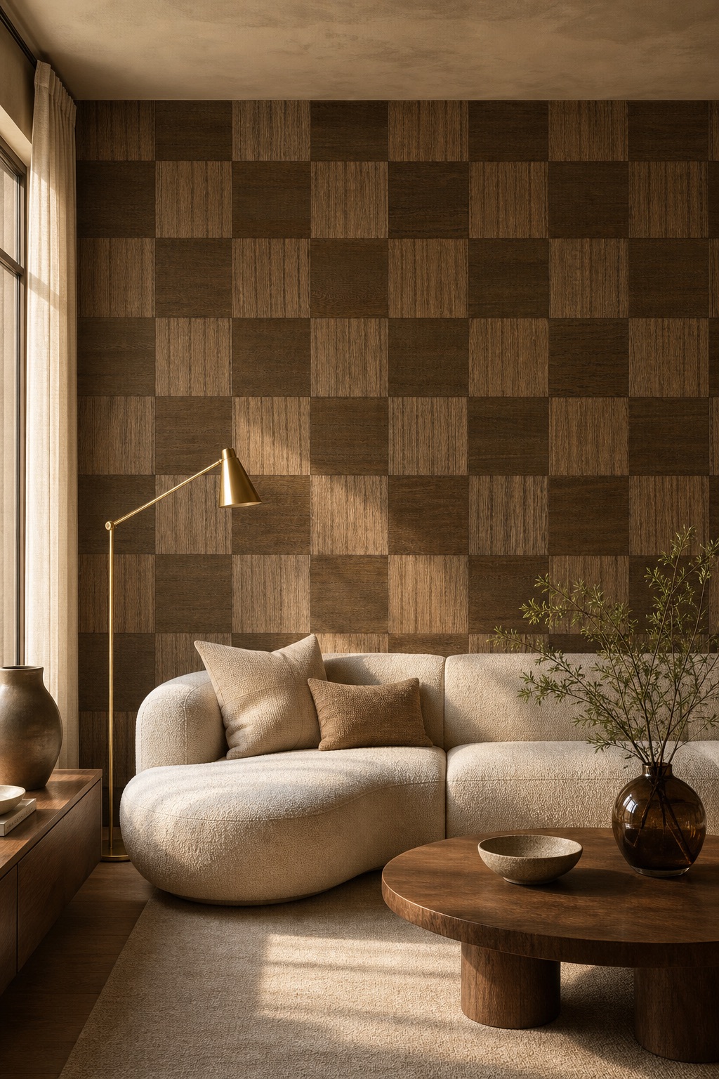
Where Walnut Veneer Wallpaper Works Best: Dining Rooms, Studies, and Hotel Suites
- Bold warm-brown geometry is most resolved as a feature wall in dining rooms, private studies, and hotel-suite sitting areas.
- The mid-century and japandi style references in the pattern respond naturally to companion materials: oak, brass, linen, bouclé, and travertine.
- In narrow corridors, high tonal contrast can read heavy — single-wall or alcove application is the most common and most composed approach.
- Hotel-suite headboard walls, restaurant booth backs, and members-club lounge alcoves are natural formats for this scale of pattern.
- The rotationally neutral tile grid makes panel-drop planning easier than a directional weave, reducing installation complexity on irregular or curved wall faces.
Walnut Checker performs best as a single feature wall or as the lining of an enclosed alcove. In a dining room it anchors the table end without closing the space; in a hotel suite it delivers warmth to a headboard wall without the bulk of a fabric panel. The mid-century geometry pairs naturally with brass, oak, and bouclé — a palette that spans residential and boutique-hospitality briefs equally well. Specifiers who have handled walnut veneer wallpaper before will find the straight-match tile grid considerably easier to plan than a random or directional layout.
Wood Veneer Wallcovering Care: What to Expect in Day-to-Day Use
- Wood veneer wallcoverings are sensitive to sustained high humidity; bathrooms and high-steam kitchens are not recommended applications.
- Surface dust and light marks can be addressed with a barely-damp cloth, wiping along the grain direction rather than across tile boundaries.
- Avoid saturating the surface: wood veneer can lift or swell at seams if water penetrates the face.
- The matte-satin topcoat provides surface protection but is not a washable coating in the contract-fabric sense; abrasive cleaning is not appropriate.
- Professional installation is advisable to ensure correct adhesive selection and precise seam placement at tile boundaries.
Like all wood-face wallcoverings, Walnut Checker performs best in climate-stable interiors with relative humidity held below roughly 65%. Light maintenance needs no specialist products — a dry or barely-damp cloth along the grain direction handles routine cleaning. Professional installation is advisable both to manage seam-to-tile alignment and to ensure the adhesive is suited to a veneer face rather than a woven substrate.
Lot Certificates, Custom Colourways, and How a Walnut Veneer Specification Comes Together
- Paid sample books are available to trade clients and credited against subsequent orders (up to 10% of the order value).
- Proofing is quoted separately upfront; production proofs are typically returned within one to two weeks.
- Production runs approximately one month; ocean freight is quoted separately and is not included in the production timeline.
- Three in-house designers work directly with client references and mood boards, converting them into production-ready CAD for our partner mills.
- Every production batch ships with a per-batch lot certificate for dye-lot traceability, essential for phased or multi-room installations.
- Our founder has been working in the natural and engineered wallcovering trade since 2018; the studio was formalised in 2023.
A specification for Walnut Checker typically begins with a paid sample book, credited against any subsequent order, followed by a paid proof run that locks tile colour and grain register before production begins. Production runs approximately one month, with ocean freight quoted separately. Every batch ships with a per-batch lot certificate, giving specifiers the traceability needed for multi-room or phased projects. Our three in-house designers have worked with walnut veneer wallpaper and engineered wood-face wallcoverings across residential and hospitality briefs; if you are working from a finish board or reference image, they can translate it into a production specification. Love the tile geometry but need a different tone or tile scale? Our design studio engineers custom colourways from your reference material, working from mood board to production CAD entirely in-house.
Frequently asked
- Will the darker walnut tiles fade noticeably in rooms with strong direct sunlight?
- Wood veneer faces, like all natural-origin materials, can shift in tone under prolonged UV exposure. South-facing rooms or installations beside full-height glazing benefit from UV-filtering glass or window treatments to preserve the contrast between the two tile tones over time.
- How do the tile seams align during installation — is there a pattern-match drop?
- The square-tile checkerboard is a straight-match pattern with no vertical drop, which simplifies panel planning and reduces offcut waste. Precise tile-to-tile alignment at seams requires professional installation; the panel seam should fall at a tile boundary rather than bisecting a tile face.
- Is Walnut Checker suitable for a powder room or entry hall with some ambient humidity?
- A well-ventilated powder room with no direct water splash is generally workable, but sustained humidity above roughly 65% risks veneer lifting at seams. We do not recommend this wallcovering for full bathrooms or steam-heavy kitchen splashback areas.
- Can this be applied to curved alcove walls as well as flat planes?
- Shallow curved features and recessed alcoves are workable with careful adhesive selection and appropriate panel preparation, but tight radii are not recommended for a wood veneer face. We advise sharing substrate drawings with our studio team before finalising the specification.
- What are the minimum order quantities and lead times for a trade order?
- Full MOQ, lead-time, and payment-terms details are covered on our process and FAQ page at /faq; contact us directly for a trade quote specific to your project.